# Dashboard Options
Dashboard options lets a user control their bot easily using rich forms. If your addon deals with persistent storage and configs, you can set up dashboard options to give users easy access to tweak them.
Dashboard options can be divided in 3 groups:
- Addon Settings - Global settings that do not depend on servers or users. e.g. An option to show embeds or plain text.
- Server Settings - Per server settings, shows up on each server's settings page. e.g An option to setting the announcement channel.
- User Settings - Per user setting, shows on each user's settings page. e.g An option to change the user's XP.
You can implement dashboard options as long as you use the database to store data in your addons. You can only use these options to modify your addon's managed data.
# Syntax Guide
Use JSON to easily add form elements. Here is a simple example:
[
  {
    "key": "roles.muted",
    "type": "roles",
    "label": "Muted Role"
  },
  {
    "key": "filteredWords",
    "type": "array",
    "label": "Filtered Words",
    "placeholder": "Enter a bad word",
    "props": {
      "required": true
    }
  }
]
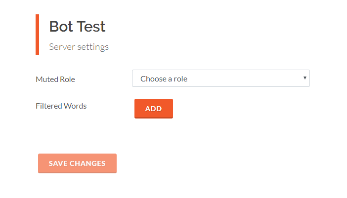
This produces a simple option on the server settings page. But there are a lot of options that you can use to modify the field.
# key
Type: string
Required: true
Specify the key you are working with. This has to be a valid schema key in your addon code.
# type
Type: string
Default: text
The type of field you want to use. You can choose between:
- text: Simple text field.
- textarea: Larger muti-row field for text.
- select: Drop down menu, to be used with options.
- checkbox: Show a single check box for boolean values.
- array: Multiple text fields in an array.
- roles: Dropdown automatically populated with the selected server's roles.
- channels: Dropdown automatically populated with the selected server's channels.
# label
Type: string
Default: Value of key
Specify a label that you want to show you the form. If not specified, it uses the key instead.
# placeholder
Type: string
Text to show when the field value is empty. Also, used for checkbox text.
# options
Type: array
Required: Only when type is select
- key: Value for the option.
- value: Text displayed on in the
selectfield. (optional)
Input options for the select field.
{
  "key": "language",
  "type": "select",
  "options": [
    {
      "key": "en-US",
      "value": "English"
    },
    {
      "key": "de-DE",
      "value": "German"
    }
  ]
}
# props
Type: object
Additional options for fields. Right now we only support one:
- required: Specify if the field is required or not.
{
  "props": {
    "required": true
  }
}